Brand Strategy & Identity for Abba Kid App
Client
Abba Kid is a Christian video app that helps children learn Bible stories and values through safe, engaging, and interactive content.
Our Approach:
- Crafting a Logo that Speaks to Both Children and Parents
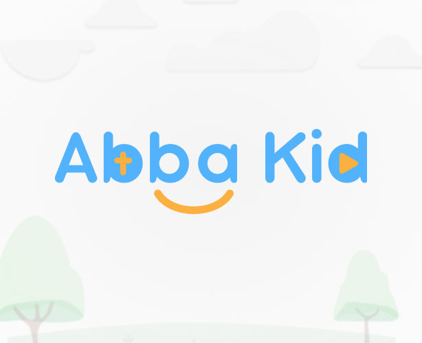
We began by designing a logo that would embody the core values of Abba Kid. The logo had to be playful enough to engage children but also convey professionalism and trust for parents. Our design team focused on simplicity and clarity, ensuring the logo would be easily recognizable and memorable for users of all ages.
We incorporated a child-friendly, vibrant color palette to evoke energy and joy, reflecting the app’s fun, interactive nature. The typography was selected with care, opting for clean, easy-to-read fonts that would be legible for young users while still maintaining a modern, approachable feel. The logo itself was designed to be versatile, scalable, and adaptable to various uses across digital and print platforms, from the app interface to promotional materials.
- Building the Brand Strategy: Consistency and Engagement
In addition to the logo, we developed a comprehensive brand strategy that extended beyond just the visual elements. The design code we created outlined the full brand identity, including color schemes, fonts, and graphic styles, ensuring consistency across all materials. This helped establish a unified visual language that aligned with Abba Kid’s mission of combining education with entertainment.
We focused on creating a design that would appeal to both children and parentsб colorful and playful enough to catch the attention of young users, while polished and professional enough to instill confidence in parents looking for a trusted educational resource.
- Design for Cross-Platform Consistency
To ensure a seamless user experience, we integrated the brand identity across the entire Abba Kid app ecosystem. From the app interface to the website and marketing materials, every element was carefully designed to maintain brand consistency. The user interface (UI) design was paired with the logo and brand visuals, ensuring the app was not only visually appealing but also easy to navigate for children.
We also provided guidelines for future use of the brand, ensuring that the identity would remain consistent as Abba Kid continued to expand and grow.
The Results:
A Strong, Recognizable Brand Presence
The result of our efforts was a cohesive, child-friendly brand identity that perfectly captured Abba Kid’s mission. The logo and design strategy created an engaging and professional visual identity that helped the app stand out in the competitive educational space. With this new branding, Abba Kid was able to build trust with parents while providing a fun, interactive platform for children.
